-
When browsing home design magazines and websites, you’ll quickly notice that many home color palettes are neutral and filled with shades of white, black, browns, and greys. We even wrote about the “light and airy finishes” trend, which incorporates a neutral palette. Many homeowners go for a neutral color palette because it’s a very safe and universal choice that most people would be content with. For this same reason, houses with neutral interiors tend to resell more quickly and easily. The drawback with neutral home interiors being so popular is that it all starts looking very similar and at times, uninspired. Adding color is more daring, which is why some people shy away from it. The use of color will make your home look more personalized and unique, especially if you plan on making it your “forever home”. Here are some tips on how you can add a splash of color to two rooms in your house, the kitchen and the bathroom.
Colored Cabinets
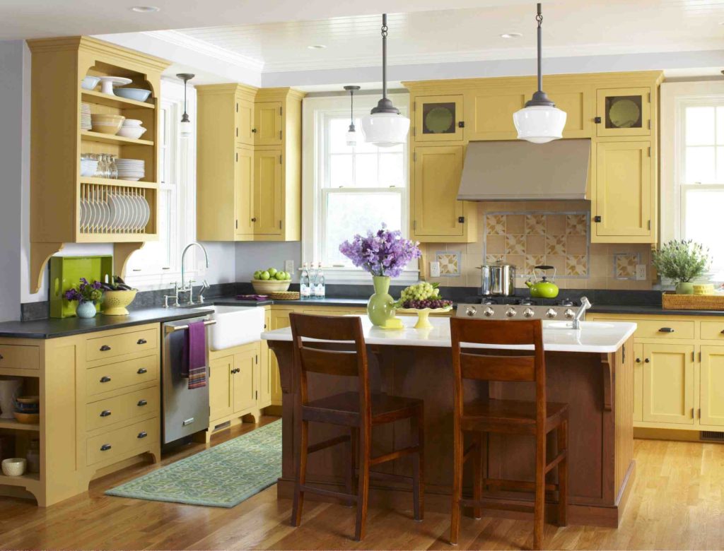
Not surprisingly, your cabinets contribute greatly to the overall look of your kitchen or bathroom. But you don’t have to go neutral in order to make your bathroom or kitchen timeless. The most popular color, after neutral colors, for both kitchen cabinets (2021 Houzz Kitchen Trends Study, page 37) and bathroom cabinets/vanities (2020 Houzz Bathroom Trends study, page 33) is blue. Blue is popular because it gives a very calming effect to the space. When it comes to choosing colors, subtle and muted tones are the most popular. Think a mellow yellow or evergreen. The country-inspired kitchen below utilizes a mellow yellow that is almost cream. This color adds warmth to the space and provides a nice contrast to the cherry wood kitchen island.
Colored Countertops
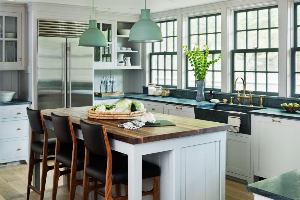
Colored countertops are less common than colored cabinets, but they really can add a creative flair to your bathroom or kitchen if used tastefully. Both natural and engineered countertops come in non-neutral colors. However, if you’re going for a bold look, then engineered stone or laminate is the way to go. The countertops in the kitchen below feature a green-tinted natural stone that can pass for gray in some angles. It perfectly contrasts with the golden brass hardware, which gives it a modern vintage vibe. This green theme is carried out throughout the kitchen, with a green sink as well as green lighting.
Colored Walls
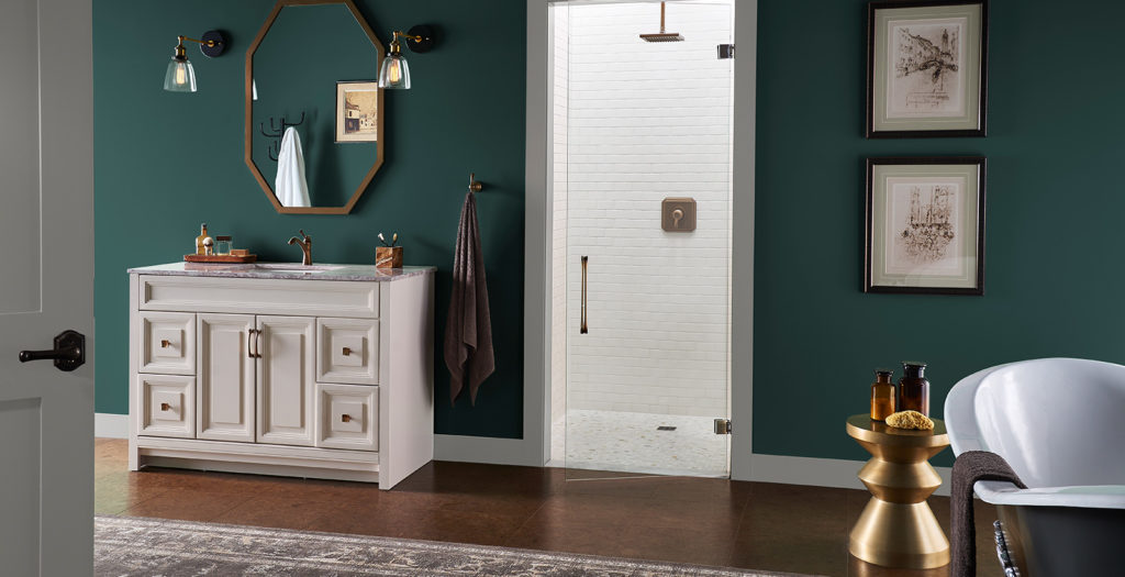
When choosing a paint color for your bathroom and/or kitchen, the key is to balance the color with your cabinets and countertops. If you are already opting for brightly-colored cabinetry, it may be best to go with a neutral paint color so that it is easy on the eyes. The trick is to not go overboard, especially when working with large areas of color that can dictate the look and feel of the entire room. Choose only one area to go bold on. Look at the example below. The designer has chosen a muted emerald green for the walls, but left everything else neutral.
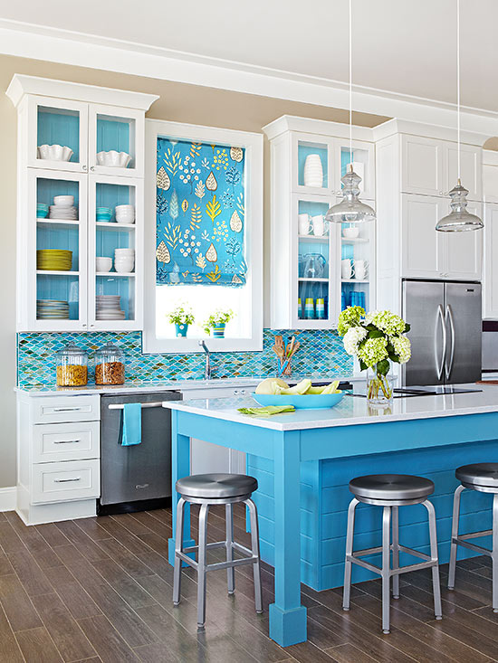
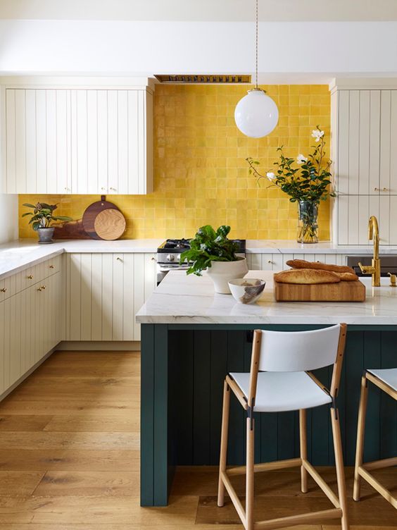
For kitchens, you can get a little more playful on backsplashes. Backsplashes are meant to be accent textures. See the designs below. We love how the bright blue backsplash complements the bright blue island in the kitchen on the left and how the bright yellow backsplash offers contrast to the green island in the kitchen on the right!
(L) Better Homes and Gardens | (R) Landed Interiors Colored Floors
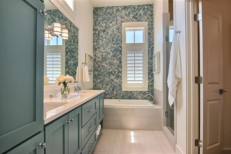
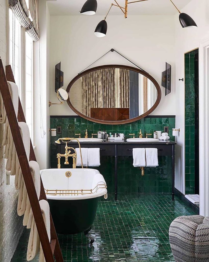
Similar rules apply when adding color to floor tiles. Stand back, look at the bigger picture and see the space as one complete room. When talking about flooring materials, tiles come in brighter colors than wood floors. For wood floors, there may be some custom or D.I.Y. work involved to give it a color wash. We love how the design below incorporates a footed tub and vintage accents along with emerald green floor tiles that run up a good portion of the walls.
Colored Decor
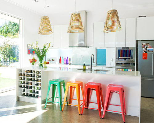
Last, but not least, the easiest way to bring color into your kitchen and bathroom is décor. The great thing about using brightly-colored décor as opposed to applying it to your cabinetry or flooring is that it is much easier and less costly to swap out if your tastes change or if you move out. The kitchen below uses a palette of rainbow colors in the form of décor.
Let Us Help You!
Quite often, we envision something in our heads that ends up not turning out the way we imagine. This is especially common with D.I.Y projects. Our job as expert consultants is to help you prevent that from happening to the best of our ability. We will work together to come up with something you love now and will love for years to come. Contact us or get a quote to get started!
Featured Image Credit: Cinnamon Shore

Showroom Hours:
M-F 10am-4pm
After hours and weekends by appointment only
Creating Beautiful Kitchens
and Baths for Over 30 Years.For a complete kitchen or bath remodel, new cabinets, refacing in wood or paint,
we have the products and expertise to serve you.
Showroom Hours:
M-F 10am-4pm
After hours and weekends by appointment only(916) 632-8299
2200 Sierra Meadows Drive, Ste. A, Rocklin, CA 95677
info@thecabinetdoctors.com
License # 779523- Roseville
- Rocklin
- Fair Oaks
- Sacramento
- Lake Tahoe
- Lincoln
- Folsom
This site is protected by reCAPTCHA and the Google Privacy Policy and Terms of Service apply.
© Cabinet Doctors . All Rights Reserved. Design By Elevate Public Relations.