-
The Summer Olympics in Paris are upon us and it had us thinking about something else the French are known for — their impeccable taste and style. There are several styles of French design including Parisian, French Country, French High-Society, and French Chateau. These styles each have subtle differences, but when done right, all exude a great level of class. Read on to find out how to design with French flair.
DOs
Add Romantic Flourishes
Pay homage to French design by adding floral borders. These ornate flourishes can take on many forms, but the most popular is through wall panels or wainscoting, which is known today as separate panels installed on the upper and lower portions of walls. The paneled interior wall look is quintessentially French, with the most elaborate of designs being popular during the 18th century Rococo era. But if the era’s maximalism isn’t your style, you can incorporate these motifs into a more minimalist space, such as in the quaint space shown below.
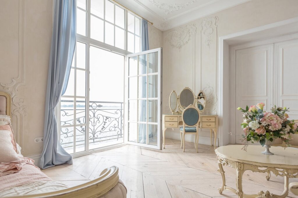
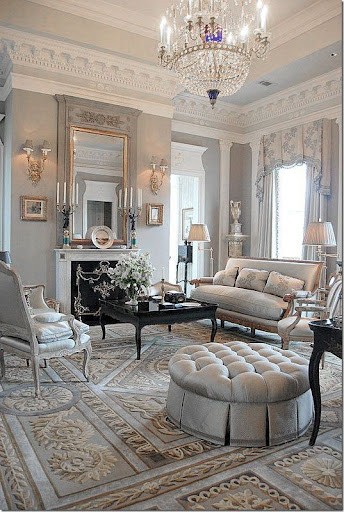
Flourishes and soft color tones create a calming feeling to this space. – Christophe Living Flourishes can also be applied to crown molding or on wallpaper, as in the following examples. In the design on the left, ornate and traditional crown molding enhances the modern Parisian design, its modernity made evident by modern furniture pieces.
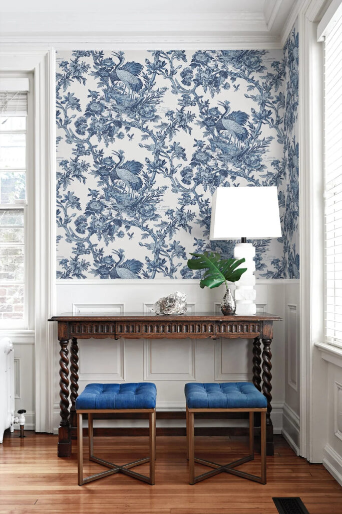
With its origins in textile printing, the fancy wallpaper pattern on the right features a single color. This pattern is called “Toile de Jouy, which in French means “cloth from Jouy,” which was the region where Christophe-Philippe Oberkampf produced the printed patterns.
Romantic flourishes make these two spaces very elegant. – Coco Lapine Design and Home Depot Use a Soft White as Your Base Color
There is a reason most walls are painted off-white by default. It is a good, neutral blank slate to start decorating with, but also timeless. The French show us exactly how to elevate whites so that it is warm and inviting.
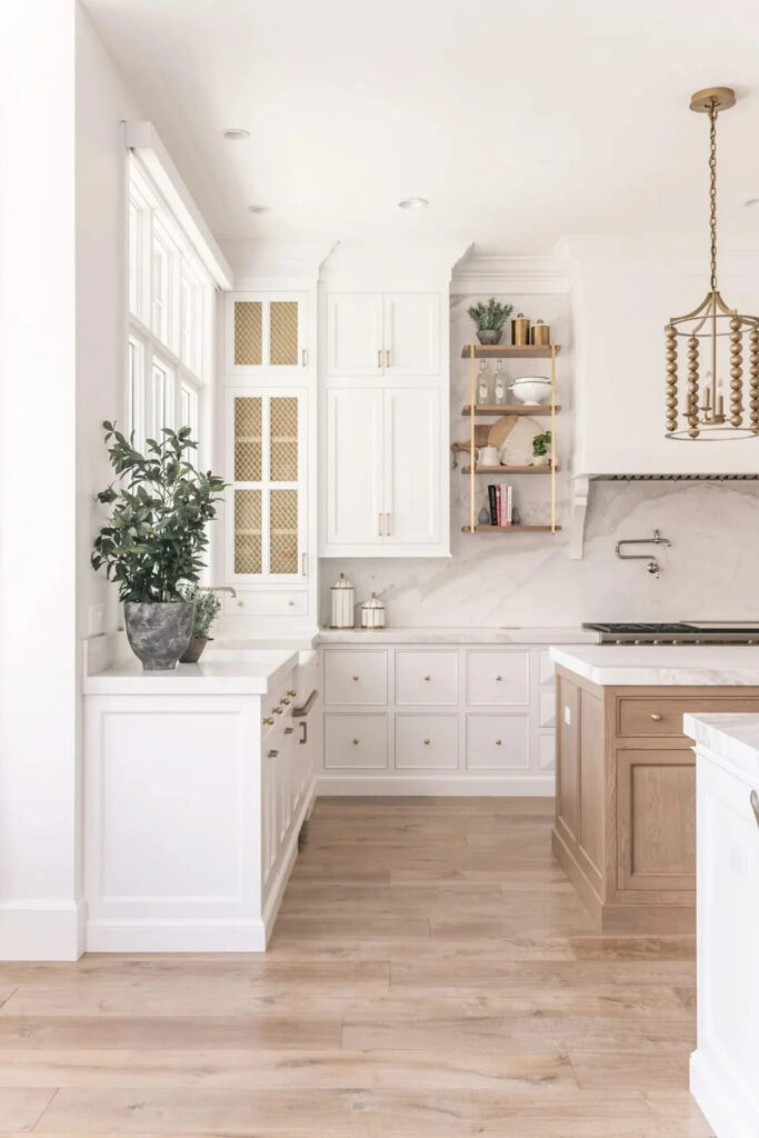
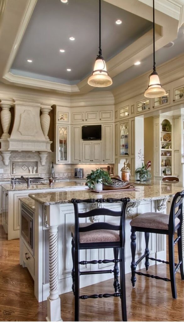
French Country style kitchens are very popular. In this style, there is an emphasis on warm tones, especially ivory and cream colors. We can see two different iterations of French Country design below, the left being a modern French Country and the right being a traditional French Country. These designs both feature a soft white as a base color.
Two French Country kitchens – modern and traditional. – Simon Design Studios and Pinterest Accent with Dark Tones for Contrast
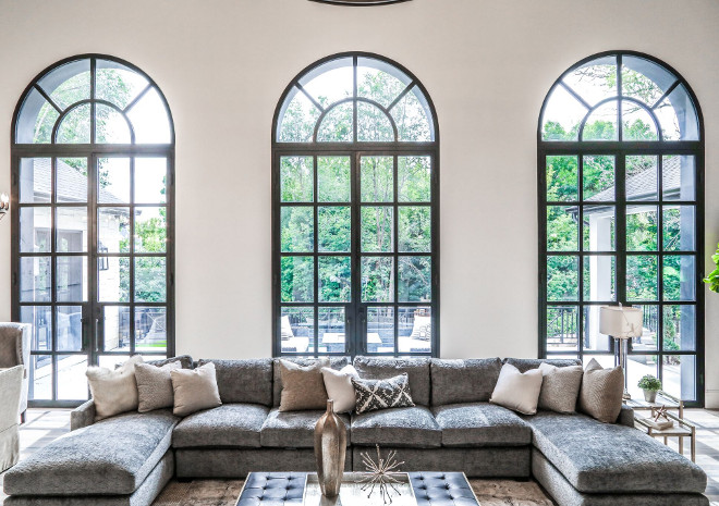
For some drama and an unexpected twist, try pairing light tones with dark ones. The design below uses a series of black iron arched windows and doorways that evoke feelings of living in a French chateau or a large French country mansion, which looks very grand and luxurious.
A French chateau-style interior with modern and traditional elements – Pinterest
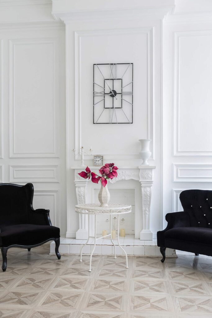
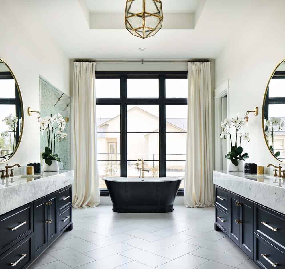
In the room below on the left, the stark contrast of the furniture with the white walls makes the design very modern Parisian. You can also see the subtle romantic flourishes on the faux fireplace.The bathroom on the right is contemporary French Country. The tub is a traditional style, but the black color makes it an unexpected and modern focal point. The black cabinets and black-framed windows tie the whole look together and create cohesion.
Both of these rooms look modern because of their play on sharp contrast. – Christophe Living and Houzz Mix and Match Different Textures
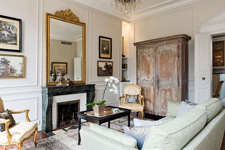
The key to an eye-pleasing design is to balance visual weights and textures across the room. Don’t let one area become too crowded and busy while other areas are barren. In the example below, the wardrobe cabinet’s rustic character stands out from the monotone white walls. The veining of the green marble fireplace also adds a luxe element to the space.
This room has many contrasting textures, ranging from smooth to rough and plain to elaborate. – Huffington Post Go for the Gold
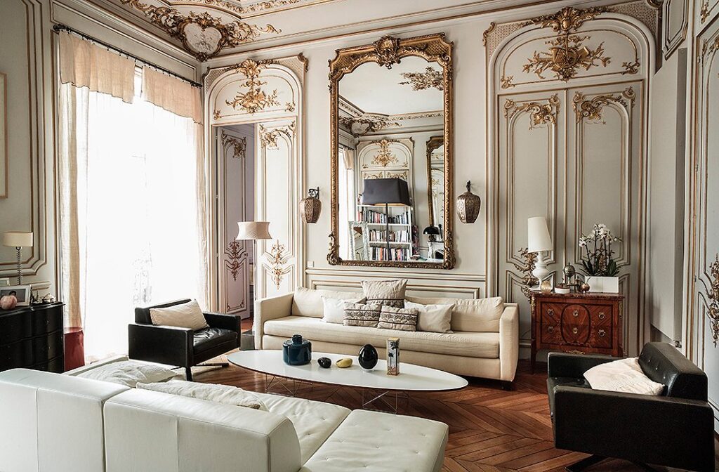
Gilded pieces add a luxurious and extravagant touch to the room. These pieces become a focal point as the eye is drawn to their metallic qualities. However, gold should still be used thoughtfully instead of appearing as if all pieces were touched by Midas.
The following design uses the color as an accent on flourishes throughout the room and on the focal point, which is the mirror in the center. Being inspired by the lavishness of Rococo design, this look is very French High-Society.With neutral tones and brushed gold, this design is very classic and appealing. – Paris Design Agenda Supersize the Drapes
Large windows are often a part of French architectural design. If you have a choice between roller shades or drapes, we say go for the drapes! Curtains bring a soft, yet majestic look to the room and that refined elegance is a key point in French design.
Large windows and tall drapes further enhance the soaring ceilings in these two rooms. – Better Homes and Gardens and Pinterest DON’Ts
Poorly Applied Wallpaper or Wall Paneling
Nothing ruins a good concept like poor execution! Paneling may look easy, but there are many nuances involved in the process. For instance, you need to ensure it is applied straight and level. Unlike your standard orange peel wall which is designed to mask imperfections, linear patterns magnify asymmetries and irregularities.
Wallpaper works in a comparable way to panels. Applying it haphazardly will magnify the imperfections on your walls. Make sure your walls are well-prepped and smooth enough before applying wallpaper. Keep in mind that thicker wallpaper can mask minor wall textures. Be sure to check the recommendations from the manufacturer before application.
Go Light on French Icons
There are more inspired ways to highlight French design than graphics of the Eiffel Tower, French phrases, or the French flag. A subtle nod to the style is more effective and timeless than exclaiming, “I love Paris!” Using too many of these French symbols can make your design seem cliche and reminiscent of a themed child or teenager’s bedroom—this is not what you want! Most professionally designed French-style rooms do not have these emblems because good designers believe it’s the details that matter.
Avoid Low-Quality Cabinets and Furniture
This tip applies to any design aesthetic. You will often be able to see the quality in a quality piece. Additionally, the most expensive option does not necessarily mean it is the highest quality or that the price is justified. You must know what to look for to determine a quality piece.
For cabinets and many furniture pieces, the wood used should be thicker and sturdier, made of solid wood, and have nicely finished edges. If the piece has doors, they should also be installed square and even.
A quality piece makes a major difference to the overall look and will make the design look upscale instead of “budget.” So, choose them wisely!
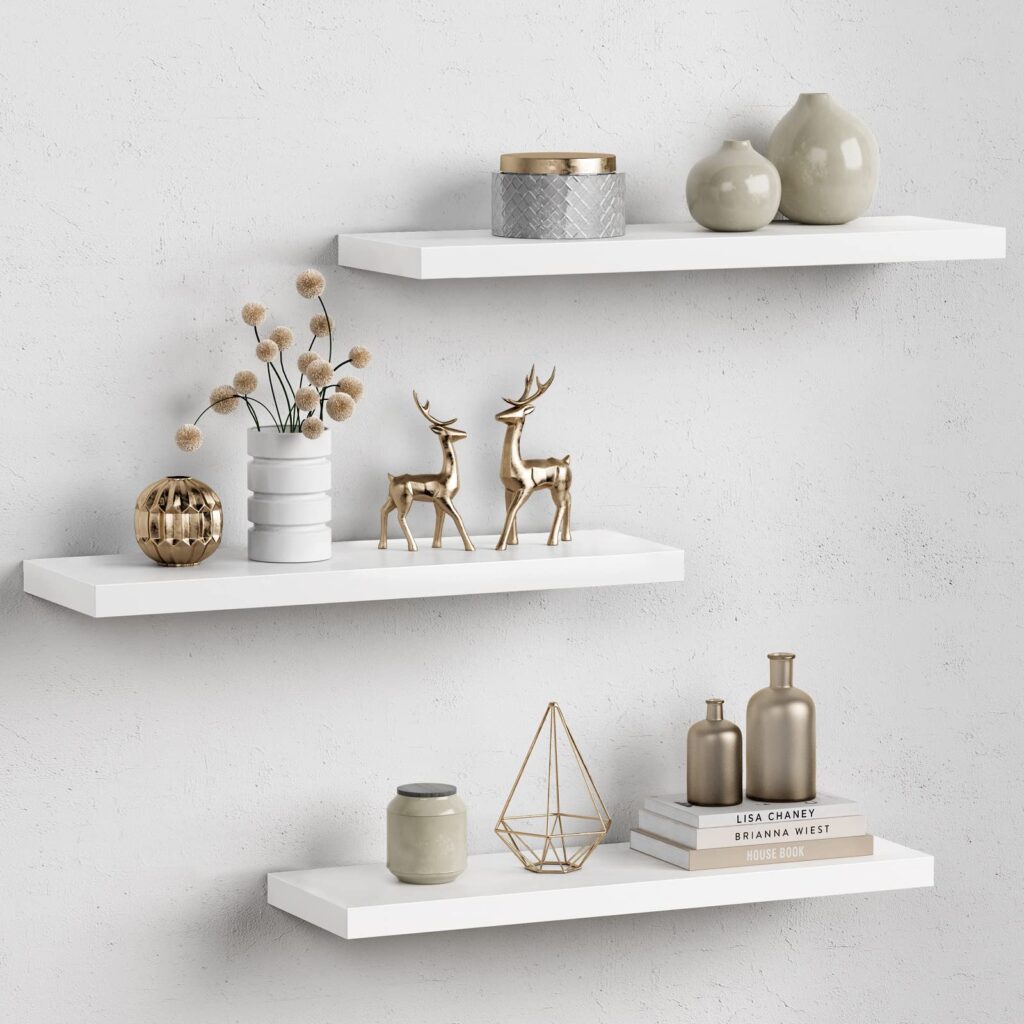
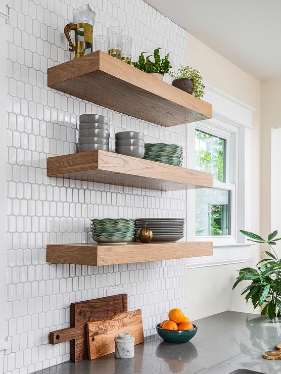
When it comes to floating shelves, a thicker shelf looks more high-quality. – Home Depot and J Thomas Home All Design Styles Under One Roof
At The Cabinet Doctors, we have designed and built modern to traditional interiors. From French Country to Modern Industrial, we have an eye for design. We focus on quality and client satisfaction and have a proven track record of happy clients.
As a family-owned business, we provide personalized service instead of a one-size-fits-all approach. Contact us today with any questions you may have or get a quote to begin your project!
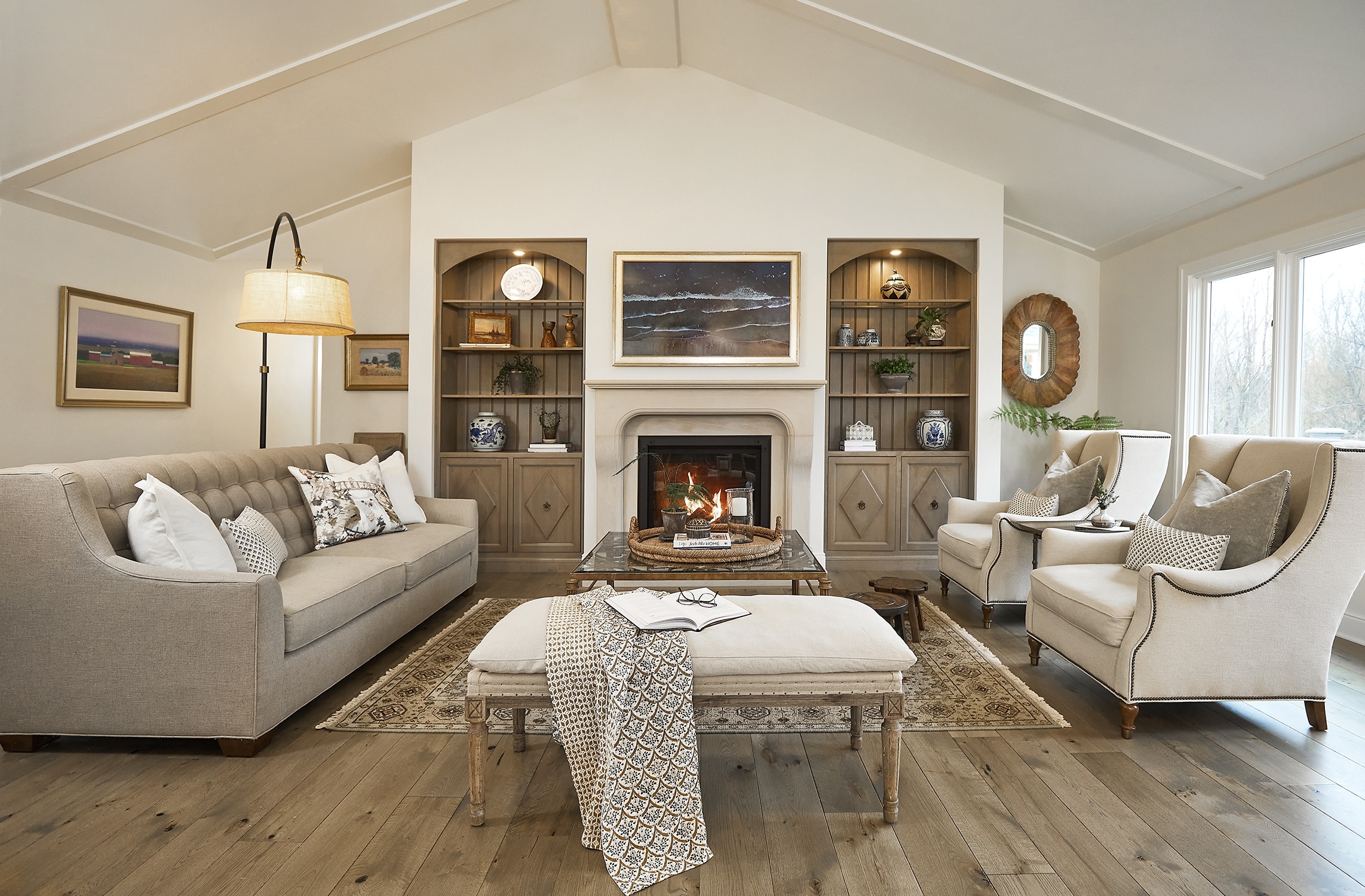
Featured Image: A French Country Living Room with Built-In Wall Cabinets – TruKitchens
Showroom Hours:
M-F 10am-4pm
After hours and weekends by appointment only
Creating Beautiful Kitchens
and Baths for Over 30 Years.For a complete kitchen or bath remodel, new cabinets, refacing in wood or paint,
we have the products and expertise to serve you.
Showroom Hours:
M-F 10am-4pm
After hours and weekends by appointment only(916) 632-8299
2200 Sierra Meadows Drive, Ste. A, Rocklin, CA 95677
info@thecabinetdoctors.com
License # 779523- Roseville
- Rocklin
- Fair Oaks
- Sacramento
- Lake Tahoe
- Lincoln
- Folsom
This site is protected by reCAPTCHA and the Google Privacy Policy and Terms of Service apply.
© Cabinet Doctors . All Rights Reserved. Design By Elevate Public Relations.

